Monday 12 December 2011
Production
I used Adobe Photoshop to complete my front cover, I found this easy as I am familer with using this software and could nagivate my way round it easily, this helped save time as we did not need a demo lesson to use it we could just get straight onto completing the front cover. I had to plan my front cover before actually doing it, this gave me time to conduct research about what my target audience would like to see in the magazine. We had 6 lessons to complete the the front cover. Using photoshop I started the front cover for my music magazine by firstly doing the minor parts of it such as the Main title, the positioning statement, the website, date and issue number. I used effects on my title to make it stand out, such as bevel and emboss. I then added the main picture and the bar code to the front cover, I cut out the main image from a background using polygonal lasso tool which helped me cut it out more accuratly. Then I added the bar code. I then added coverlines and put bevel and emboss effects on it, so they stand out. I have added a main headline, a box and text at the bottom that have some of the smaller stories inside, also I added the price onto the bottom of the magazine, and I added another cover line onto the top in a circle, this will stand out as this is an important story, but not as important as the main headline so therefore it doesnt need to stand out as much.

Contents Page
Using Quark Xpress was a new software to me, and I had to take time to get used to it, I got to grips with how to use it in the demo lesson- this was time consuming but worth it as I wouldnt of known what to do, and therefore more time would of been wasted. It was good using Quark as you get to really see what its like to make a magazine. We took 2 lessons to make this.

Double Page Spread
We used Quark Xpress again to make our double page spread, this was easy as we had previously used it to complete our contents page, this saved time as I was familer with using this software. We basically only had to use one page as the other image dominated the other facing page. This took 2 lessons to complete.

Questionnaire
Questionnaire
Please could you take
the time to complete this questionnaire?
1. Do you think the colours that I have used on the
products- Front cover, double page spread and contents page, look like indie
colours?
Yes
No
2. If so why? _______________________________________________________________________________
_______________________________________________________________________________
3. Do you think that Indiependent looks like an Indie
magazine?
Yes
No
4. Would you buy the magazine by looking at the front cover?
Yes
No
5. If so, what makes you want to buy it?
_______________________________________________________________________________
_______________________________________________________________________________
6. Name three things that you like about my magazine.
·
_________________________________________________________________________
·
__________________________________________________________________________
·
__________________________________________________________________________
7. Name the main things that you would change about the
magazine, if there is anything.
_________________________________________________________________________________
_________________________________________________________________________________
__________________________________________________________________________________
8. Would you pay £2.30 for the magazine?
Yes
No
9. If not explain why and what you would pay.
_________________________________________________________________________________
__________________________________________________________________________________
10. Do you think that the colour scheme is consistent?
Yes
No
11. Do you think that everything anchors in with each other?
________________________________________________________________________________
________________________________________________________________________________
12. Do you think that the cover lines on the front cover
makes you want to read and buy the magazine?
Yes
No
13. If so why?
_________________________________________________________________________________
_________________________________________________________________________________
14. Do you think that the images are relevant to the stories
in the magazine?
Yes
No
15. Do you think that the main storyline on the front
magazine looks interesting?
Yes
No
16. If yes, why does it draw you into wanting to read it?
_______________________________________________________________________________
________________________________________________________________________________
_________________________________________________________________________________
Rough layout of double page spread
For homework, I sketched my double page article onto two A4 peices of paper, we did this so it is easier for us to change before we completed it on the computer. It was also good to sketch it out before actually doing it because if we did it wrong we would be able to just rub it out rather than deleting all the work on the computer- this saves us time, so then we have more time to improve the work that we have done.

This is the image of the article that I will be using, I will be typing out the main lyrics of the song that I made up, and then adding doodles to the work to make it look like Kate Nash had wrote the lyrics herself. Making my own A4 sketch to start with before actually making it on the computer will save time.


This is the image of the article that I will be using, I will be typing out the main lyrics of the song that I made up, and then adding doodles to the work to make it look like Kate Nash had wrote the lyrics herself. Making my own A4 sketch to start with before actually making it on the computer will save time.

This is the article, I wrote it out before actually putting the work on my blog, as I could get a teacher to proof read it to check for spelling mistakes and puncutation errors. This helps me as I can see the layout of the page before doing it so I know where I'm working from when I get onto the computer.
Production of double page spread
This the the article I am going to use for my double page spread, we wrote it and then had chance to redraft it after our teacher had read through it to make improvements. This is my final piece.
This album explored Kate’s past and showed everyone that she didn’t care, and that she liked to be different. Kate says “I want to say that I don’t care, but everyone’s human and if people slag you off it’s not nice”. She has her own opinion on everything, as we can clearly gather from this relating this to her unusual song titles that she has came up with, “Mouth Wash” We would see this as abnormal, but to her it would mean something.
Moving forward in Kate Nash’s career, after the Made of Bricks album her
career rocketed up and then in 2009 she made My Best Friend Is You, she dedicated this album to her boyfriend Ryan Jarman who she has been with for a number of years. In this album the song titles show us that they could relate to her boyfriend Ryan by using names such as, ‘I just love you more’ and ‘You were so far away’.
Kate has built up her career by helping others when she had spare time she would spend it helping others such as helping to produce a teenage band called Supercute! Kate took a huge role of helping them produce their first album. Kates soft spot came out by using social networking sites such as Facebook and MySpace, Kate managed to spread the word about a young girl who needed help called Tilly who lost her hands due to meningococcal diease. Kate set up an auction site on eBay to help donate money to this five year olds parents, so she could have a start up fund to eventually buy her own pair of hands. She has also recently formed after school clubs for students who are interested in the music industry.
We haven’t heard much of Kate Nash over the past year, as she has been in the recording studio for the past year, working on her latest album, Nash has been working with William Orbit, Mark Ronson and Cameron McVey on her third studio album which will follow up from her last album, My Best Friend is You. Could this be a different direction for Kate? Due to working with Mark Ronson who mainly specializes in dance music. In January 2011 Kate Nash exposed that she was working on a new upcoming album and will be releasing it in 2012.
Back in 2007, with the release of her just studio album Made of Bricks, Kate Nash announced herself to the world. Looking up to idols such as Kathleen Hanna, Billy Childish and Lydia Lunch helped make this album how successful it is today as it topped the billboard 200 at the number 36.
Moving forward in Kate Nash’s career, after the Made of Bricks album her
career rocketed up and then in 2009 she made My Best Friend Is You, she dedicated this album to her boyfriend Ryan Jarman who she has been with for a number of years. In this album the song titles show us that they could relate to her boyfriend Ryan by using names such as, ‘I just love you more’ and ‘You were so far away’.
Kate has built up her career by helping others when she had spare time she would spend it helping others such as helping to produce a teenage band called Supercute! Kate took a huge role of helping them produce their first album. Kates soft spot came out by using social networking sites such as Facebook and MySpace, Kate managed to spread the word about a young girl who needed help called Tilly who lost her hands due to meningococcal diease. Kate set up an auction site on eBay to help donate money to this five year olds parents, so she could have a start up fund to eventually buy her own pair of hands. She has also recently formed after school clubs for students who are interested in the music industry.
We haven’t heard much of Kate Nash over the past year, as she has been in the recording studio for the past year, working on her latest album, Nash has been working with William Orbit, Mark Ronson and Cameron McVey on her third studio album which will follow up from her last album, My Best Friend is You. Could this be a different direction for Kate? Due to working with Mark Ronson who mainly specializes in dance music. In January 2011 Kate Nash exposed that she was working on a new upcoming album and will be releasing it in 2012.
Production of photographs
In todays lesson I gathered the material I need to start producing my magazine.
I took these photos for my Front Cover:


I took these photos for my Double Page Spread:


I took these photos for my Front Cover:
- The main image on the front cover, was took various times and I had to change it once, as it was not suitable so therefore I had to change it to make it suitable for the front cover.
- I took a print screen of my front cover and imported it onto the Contents Page.
- Large headphones on top of an AMP.

- A picture of 'The Editor'

I took these photos for my Double Page Spread:
- A picture of just some bricks

- A picture of a map

Thursday 8 December 2011
Article Research
Information on Kate Nash
Kate Marie Nash (born 6 July 1987) is an English singer, songwriter, and musician. Following intensive touring Nash had what she described as a "proper breakdown". Nash experienced a relapse of obsessive-compulsive disorder, which she had a mild case of as a child. She has railed against the anemic model figure, noting in an interview with the Daily Telegraph that she herself is a "curvy size 12.
Nash started her career in 2005. After several gigs, she uploaded her music to MySpace. She found a manager for herself before seeking producers for her music
Nash performed at numerous festivals including Wireless Festival, Bestival, Electric Gardens, Glastonbury, Latitude, Reading and Leeds, Oxegen and T in the Park.
As a small job Kate joined a punk band called The Receeders.
Nash was born on 6 July 1987 in Dublin, Ireland and grew up in Harrow.
On 2 September 2009, Nash began using her MySpace and Facebook pages to help spread the word of a young girl called Tilly who lost her hands due to meningococcal disease. She used an auction on eBay to help donate money to the five-year-old girl's parents so that she can afford to have her own pair of hands.
Nash is going to be working with the teen indie pop band, Supercute!, producing their first album.
I want to say I don't care, but everyone's human and if people slag you off it's not nice," says singer-songwriter Kate Nash.
Kate Marie Nash (born 6 July 1987) is an English singer, songwriter, and musician. Following intensive touring Nash had what she described as a "proper breakdown". Nash experienced a relapse of obsessive-compulsive disorder, which she had a mild case of as a child. She has railed against the anemic model figure, noting in an interview with the Daily Telegraph that she herself is a "curvy size 12.
Nash started her career in 2005. After several gigs, she uploaded her music to MySpace. She found a manager for herself before seeking producers for her music
Nash performed at numerous festivals including Wireless Festival, Bestival, Electric Gardens, Glastonbury, Latitude, Reading and Leeds, Oxegen and T in the Park.
As a small job Kate joined a punk band called The Receeders.
Nash was born on 6 July 1987 in Dublin, Ireland and grew up in Harrow.
On 2 September 2009, Nash began using her MySpace and Facebook pages to help spread the word of a young girl called Tilly who lost her hands due to meningococcal disease. She used an auction on eBay to help donate money to the five-year-old girl's parents so that she can afford to have her own pair of hands.
Nash is going to be working with the teen indie pop band, Supercute!, producing their first album.
However, I also think it's important not to be bland and if people didn't hate you, then people wouldn't really love you either. So if you have people who don't really like you, then it's a good sign," she theorises.
I want to say I don't care, but everyone's human and if people slag you off it's not nice," says singer-songwriter Kate Nash.
She released her second album, My Best Friend Is You, and says she has had to learn to ignore overly-critical reviews.
My Best Friend Is You is talking about her boyfriend that she has been with since 2007.
Thursday 10 November 2011
Planning Production
I have concluded all the research I need I can now make detailed desicions about my magazine that I am going to produce.
-Is it the end for the Kings Of Leon
-2012 mapped out
-2011's big reunion
-Indie music festival
-The Kooks - Fading Away
-Large bold title
-Drop capitals :on the editors letter
-Bold cover lines
-Colour scheme to fit in with the colours I have chosen
-Page numbers in a different colour to the writing
-A picture of the person/or something relating to the DPS.
-An image relating to one of the cover lines on the front cover
- Front cover of the image: will be a girl (dressed in Indie clothes) posing
- Coverlines for my front cover:
-Is it the end for the Kings Of Leon
-2012 mapped out
-2011's big reunion
-Indie music festival
-The Kooks - Fading Away
- Text for my contents page:
-Large bold title
-Drop capitals :on the editors letter
-Bold cover lines
-Colour scheme to fit in with the colours I have chosen
-Page numbers in a different colour to the writing
- Images I will need for my contents page:
-A picture of the person/or something relating to the DPS.
-An image relating to one of the cover lines on the front cover
- The article I am going to write for my double page spread:
- In this lesson I drawn out a rough sketch of the plan of my front cover, I done this because it will be quicker when I actually do come to make the front cover on photoshop, as it wont be all on the spot thinking-which will increase the time I take to make it. It gives me an inital plan on what to do and once the teacher has checked it, I can move onto make it, rather than just making it and it being wrong and having to re-do it again, so it also saves alot of time.


Wednesday 9 November 2011
Publication Plan
Publication Plan
Title: Indiependant
Positioning Statement: Influencing your life
Frequency of Publication: Monthly
Price: £2.30
Distribution: Newsagents and Supermarkets
Rationale: This magazine shows the readers the inside like to the music world, and how the Indie music stars live their lives. We will offer a magazine that has interviews, exclusive pictures. It will pretty much focus on the fans of the music world and show them exactly what they want.
Style: The magazine will be very informal, as the music world is not exactly the most formal thing and we would like to relate it to the actual music world. The vocabulary will be very simple as people as young as 16 will be reading the magazine and they will need to understand the words, but the writing won’t be to simple as the older ages that are reading it 18+ will find it boring. There will be strong humour in the magazine as the readers will get bored if it’s all non humorous.
Regular Content
· Editors letter
· Gig Guide
· Competitions
· Interviews
· Exclusive pictures
· Gossip on the performers
· Poster page
· Fans forum
· Exclusive pictures of the bands rehearsals
· Update on new song releases
Feature Content
· Removing the Rubble. Lisa Occhino - Indie bands helping Japan earthquake horror become back to normal.
· Owl city comes alive. –Owl city speaks about their new tour and upcoming album release.
· Is it the end for Kings of Leon? – Truth about splitting
· Florence and The Machine shakes it out – speaks about her appearance on the x-factor
· Road to Rock Fame
· Tribute act to Amy Winehouse – Interview
· Arctic Monkeys go on a road trip.
· New Labels!
· Indie Music Festival - See all the new artists, non signed artists and old artists in a Leeds festival
· Alex Turner
· 2011's Big Reunion - An old band comes back together
· 2012 Mapped out
· The Kooks- Fading Away
House Style
Coverlines: italic and in Arial
Headlines: Arial black
Stand First: Berlin Sans FB Demi 16pt
Captions: Arial 8pt
Features first paragraph: Arial black, 4 lines deep
News first paragraph: First three words in BOLD CAPITALS
Body text: Tahoma 11pt
Colour scheme: Brown, Red, Orange.
Monday 24 October 2011
Audience Research- Results and Conclusions
I asked 20 people questions to suit how I would plan my magazine, I will take these results to build ideas to produce my magazine.
Results and conclusions
View more presentations from daniellecleary.
Friday 21 October 2011
My Questionnaire
I have formed a questionnaire that will enable me to see what the public will like, and therefore buy, I will make my magazine according to their results.
This is the Questionnaire..
1.How old are you?
2.Are you male or female?
Male? Female?
3.What is your favorite music magazine?
4.What would you rate Indie genre out of 10?
5.What are your three favorite colours?
6.What is your favorite Indie singer or band?
7.What three words would you associate with Indie?
8.What would you like to see in the magazine?
9.Would you buy the magazine just to read one article?
10.What is the most you would pay for a magazine?
£0.50-£1.00? £1.00-£2.00? £2.00-£3.00? £3.00?
11.How often would you like the magazine to be issued?
Weekly? Monthly? Yearly?
12.Do you enjoy listening to Indie or is there any other genre that you prefer?
13.How many pages would you like the magazine to have?
14.What is your favorite Indie song?
15.What mood do you associate with Indie music?
Tuesday 18 October 2011
Monday 17 October 2011
Friday 14 October 2011
Saturday 8 October 2011
Initial Ideas For My Magazine
In this lesson we reseached into our magazine choice I made decisions about my magazine that is very important to the making of the magazine.
Price: £2.30
Frequency Of Publiction: Monthly
Average Issue Size: 30 Pages
Regular Content: Interviews and pictures
Feature Articles: A band article
Price: £2.30
Frequency Of Publiction: Monthly
Average Issue Size: 30 Pages
Regular Content: Interviews and pictures
Feature Articles: A band article
Friday 7 October 2011
Researching the market place.
After reseaching on the internet the different types of magazine, I found various magazines that I could focus my magazines on.


Media Pack:http://www.nme.com/mediapack/pdf/nme_media_information_full.pdf

Media Pack:http://www.bauermedia.co.uk/Global/mediapacks/Kerrang.pdf
Here is a link to the nme website that shows us the target audience, and what the magazine offers.
http://www.ipcadvertising.com/ipc-brands/2009/feb/03/nme
The click on View media pack underneath the article.
Kerrang is a music magazine with over 404,000 people reading it. Its target audience is teenagers, who are interested in different genres of rock music. In the magazine it shows the reader different types of bands they love and then newer bands that have came into the music industry. The magazine gives you the latest gossip of the music world. I will look at the type of magazine to make my magazine similar to this one, as it is very sucessful.
http://magazines.bauermediaadvertising.com/magazines/detail/kerrang

Price: £4.50
Frequency of publication: 12 issues per year
Issue size (number of pages):60
Media Pack:http://bauermediaadvertising.com/uploads/Mojo-MediaPack-2011.pdf
Price: £1.75
Frequency of publication: Once a week, every Wednesday
Issue size (number of pages):40
Regular Content: Big-name interviews, gig guides, new band info and in-depth music news debate
Media Pack:http://www.nme.com/mediapack/pdf/nme_media_information_full.pdf

Price: £2.20
Frequency of publication:Weekly
Issue size (number of pages):50
Media Pack:http://www.bauermedia.co.uk/Global/mediapacks/Kerrang.pdf
Here is a link to the nme website that shows us the target audience, and what the magazine offers.
http://www.ipcadvertising.com/ipc-brands/2009/feb/03/nme
The click on View media pack underneath the article.
Kerrang is a music magazine with over 404,000 people reading it. Its target audience is teenagers, who are interested in different genres of rock music. In the magazine it shows the reader different types of bands they love and then newer bands that have came into the music industry. The magazine gives you the latest gossip of the music world. I will look at the type of magazine to make my magazine similar to this one, as it is very sucessful.
http://magazines.bauermediaadvertising.com/magazines/detail/kerrang
Initial Ideas.
After researching into what type of music magazine I was going to design, Indie is the genre that stood out to me, as it was set aside to me from the other genres, as I have never been as interested in this genre as other magazines, this will help me look more into depth about the genre and learn as I am completing my task. I will appeal my magazine to both genders and 16-24 years old with an interest of this type of music.
Tuesday 4 October 2011
Preliminary Magazine Evaluation
For homework we got set the task to evaluate the work we have done for our front cover and contents page of the school magazine that we have completed.
Weatherwatch outlines an everyday magazine, with stories, competitions and everyday news. It is a magazine especially designed for the students of Weatherhead, basically like a newsletter but in more depth.
The front cover of the magazine is very much like 'New' and 'OK' but with a school twist. It follows codes and conventions in very many ways it has a big bold title that stands out from the rest of the magazine. There is one main image that dominates the page, if someone was to pick up the magazine this would be the first thing the eye would see. The taglines give a brief description of the stories in the magazines. There is a tagline in the bottom left hand corner. The person in the image creates eye contact with the audience, this is called direct address. The body language of the girl fits the genre as the girl is dressed in a school uniform. The issue and date are always situated at the top of the front cover above the main title, or by the barcode.
In some ways the front cover doesnt follow the codes and conventions because the postioning statement is above the main title. The front cover does not have any buzzwords, these are some of the things I will need to work on it to make my work better.
The contents page meets the codes and conventions as it has a screenshot of the main front cover. The font is continuous throughout both pages. The issue number and date is situated at the top of the page. It has a buzzword ''your exclusive magazine'' this makes the reader thing they are getting more for their money. Images have taglines to give a brief description of the story.
Contents Page
Using Quark was a hard task as I havent used it before, we had a lesson to experiment with the software, I got familar with using it rather quickly and I was then prepared to complete my task. By drawing a sketch of the layout of the contents page it made it easier to follow and complete the work in the time given.

This is the final idea I made on Quark for my contents page.

Front Cover
In todays lesson we completed the Front Cover of our magazines on Photoshop. We completed this task in one lesson. As I have used Photoshop before I thought this task was straight forward and thats why I could complete it in the time available.


Production of school magazine front cover.
This was the process I went through to create my front cover and my contents page, using photoshop for my front cover and quark for my contents page.
This is the Front cover...

I started off with the blank canvas and put a colour background on it, that matched my colour scheme.

I then cut out the image of the girl using the magic wand tool, I also used the blur tool to blur the hair around.

I then added the title with the font that I am going to use the whole way through, the title is going to be bigger than all the other writing as its one of the main aspects of the front cover apart from the main picture.

I put the positioning statment above the title in the same writing to keep it all consistant.

The price was put in the same writing at the top of the magazine, so the reader can clearly see it.

The main story line-that reflects the main image, is in partly in capitals and is in the same writing and also in a the colour scheme I have chosen to use, Weatherhead colours.

I added in the issue date and the issue number to the bottom of the magazine, this sits around the barcode.

Story lines are being added in, in the same colours and writing. This is consistant.

The image that has been added in was one that I have took myself around the school, it reflects the story that it represents.

Other storylines have been added.

Relevent images have been added to show the storylines. I took these pictures myself.

Another story line was added across the top underneath the main title.. This stands out as its in grey and is in the same colour scheme, and the same writing.

A small tag line to the 'Take a Trip with Weatherhead' was added to give a small dose of information to the readers without them actually reading the article.

Capital letters and exclamation marks are used in the 'wanted' part, this draws the readers in and it stands out, using the same colour scheme and writing.

The bar code is added to the left handside bottom corner of the magazine. This follows the codes and conventions of a magazine front cover.
Sunday 2 October 2011
Photographs for school magazine
In todays lesson we took pictures for our front cover, we then uploaded them onto the computer and evaluated them, and seen if there was anymore images that we had to take to complete our work. We then took more images-the ones that we didnt take properly and re added them onto the computer
..


..

This is the main image for the front cover.. A medium close up.

This is one of the articles appearing in the magazine about 'Ice Radio'.

This is another one of the pictures that will appear in the magazine about 6th form life,
Saturday 1 October 2011
Rough Layout of the Contents Page
This is the A4 drawing I made to complete my Quark presentation. This saved time whilst doing my work on the computer as I had an initial plan to stick to.


Friday 30 September 2011
Planning content
The regular content that will appear in my magazine is..
- Competitions for students to enter into
- Information about the school and different things available to do
- Advertisements for the school needs
- Interviews
- About the 6th form life
- Weathertots are looking for volunteers to work
- Interview with the headteacher
- Presenters for Ice Radio are wanted
- New Uniform
- Trips with Weatherhead
A list of images I will use on my contents page..
- A screen shot of the front cover
- A picture of a Paris trip
- A image of Ice Radio door
Rough Layout of the Front Cover
This is the A4 magazine plan I drew before completing the work on the computer, this made it easier as I had something to go by when doing my work, so it was just not all on the spot thinking.


Tuesday 27 September 2011
Plans For Front Cover
In today's lesson we built up important information about our magazines that will help us to complete the tasks quickly and more detailed as we have had time to plan the magazine before just making it.
Details of the Mise-En-Scene of your front cover image-The image on the front cover is a girl in uniform which is a medium close up, this shows us that it is aimed at younger people who are in education, the way the girl is looking into the camera shows direct address. The colours I have chosen fit in with the picture as the colour scheme is the school colours, lilic and blue.
Cover lines for the front cover of your magazine-Get your place at Weather Tots..
I didnt use any cover lines, as I would say cover lines are there to explain abit about the article, where as if you looked at my titles for the articles, I would say they are self explanitry and there is not much more you could write about it.
Camera Shots
In today's lesson we took pictures of different camera angles, we then took notes down off the board about the different angles, and became more familiar with them as we got shown the different angles. We then took a camera and tryed out the different angles for ourselves, as we had a list of shots we had to get from around the school, I was familar with using the camera, and I have done Media in previous years, so therefore I thought this was an easy task. We then uploaded the pictures we had took onto the computer and the ones that werent the exact shots that we needed were deleted and re-took.


- A low angle medium close up- This is were the camera is pointing upwards to the person, only getting their top half captured.
- A high angle long shot- This shot is took from above the person with the whole body being captured.
- An extreme close up of the time- This is a shot that is very close to the image being taken.. In this case it is a clock.
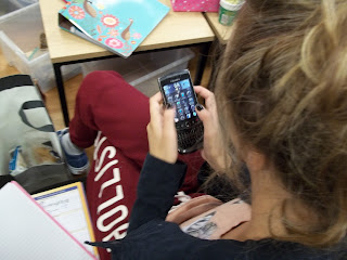
- A big close up of someone using a phone- This is a shot taken with the shoulders upwards of a person, holding a phone.
- A close up of someone in 'nature'- This is a shot taken from the shoulders upwards in a nature environment.
- A 2 shot in medium long shot- This is a shot with 2 people being captured with the knees upwards.
- An over the shoulder of someone writing- This is an image over the shoulder took of a person. In this case its of the person writing.
- A very long shot conveying isolation- This shot is the whole body (and quite far away) from the person with no-one surrounding them. (Showing they are on their own).
- A medium close up- This is a shot with the shoulders upwards of a person.
- A Long shot- This fits the whole body in the image.
- A photograph which has connotations of friendship.- This shot is an image that is not allowed any person in it, but you have to use your imagination to get a shot that makes you think of friendship. For example just 2 hands holding.
- A photograph which has connotations of stress- This shot is an image that is not allowed any person in it, but you have to use your imagination to get a shot that makes you think of stress. For example a pile of school books.

Over the shoulder shot on the phone.

Over the shoulder shot of someone writing.

Medium close up.

A long shot.

An extreme close up of time.

A big close up of someone using the phone.

A high angle long shot.

A low angle medium close up.

A close up of someone in 'Nature'.

A two shot in medium long shot

An image that has connotations of friendship.

An image that has connotations of stress

A very long shot that shows iscolation
Subscribe to:
Posts (Atom)