Friday 30 September 2011

Planning content

The regular content that will appear in my magazine is..

  • Competitions for students to enter into
  • Information about the school and different things available to do
  • Advertisements for the school needs
  • Interviews
A list of the articles..

  • About the 6th form life
  • Weathertots are looking for volunteers to work 
  • Interview with the headteacher
  • Presenters for Ice Radio are wanted
  • New Uniform
  • Trips with Weatherhead
A list of images I will use on my contents page..
  • A screen shot of the front cover
  • A picture of a Paris trip
  • A image of Ice Radio door

Rough Layout of the Front Cover

This is the A4 magazine plan I drew before completing the work on the computer, this made it easier as I had something to go by when doing my work, so it was just not all on the spot thinking.


Tuesday 27 September 2011

Plans For Front Cover

In today's lesson we built up important information about our magazines that will help us to complete the tasks quickly and more detailed as we have had time to plan the magazine before just making it.

The title for my new school magazine is going to be- Weatherwatch
Details of the Mise-En-Scene of your front cover image-The image on the front cover is a girl in uniform which is a medium close up, this shows us that it is aimed at younger people who are in education, the way the girl is looking into the camera shows direct address.  The colours I have chosen fit in with the picture as the colour scheme is the school colours, lilic and blue.
Cover lines for the front cover of your magazine-Get your place at Weather Tots..
I didnt use any cover lines, as I would say cover lines are there to explain abit about the article, where as if you looked at my titles for the articles, I would say they are self explanitry and there is not much more you could write about it.

Camera Shots

In today's lesson we took pictures of different camera angles, we then took notes down off the board about the different angles, and became more familiar with them as we got shown the different angles.  We then took a camera and tryed out the different angles for ourselves, as we had a list of shots we had to get from around the school, I was familar with using the camera, and I have done Media in previous years, so therefore I thought this was an easy task.  We then uploaded the pictures we had took onto the computer and the ones that werent the exact shots that we needed were deleted and re-took.
  • A low angle medium close up- This is were the camera is pointing upwards to the person, only getting their top half captured.
  • A high angle long shot- This shot is took from above the person with the whole body being captured.
  • An extreme close up of the time- This is a shot that is very close to the image being taken.. In this case it is a clock.
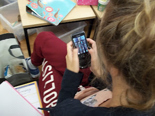
  • A big close up of someone using a phone- This is a shot taken with the shoulders upwards of a person, holding a phone.
  • A close up of someone in 'nature'- This is a shot taken from the shoulders upwards in a nature environment.
  • A 2 shot in medium long shot- This is a shot with 2 people being captured with the knees upwards.
  • An over the shoulder of someone writing- This is an image over the shoulder took of a person. In this case its of the person writing.
  • A very long shot conveying isolation- This shot is the whole body (and quite far away) from the person with no-one surrounding them. (Showing they are on their own).
  • A medium close up- This is a shot with the shoulders upwards of a person.
  • A Long shot- This fits the whole body in the image.
  • A photograph which has connotations of friendship.- This shot is an image that is not allowed any person in it, but you have to use your imagination to get a shot that makes you think of friendship. For example just 2 hands holding.
  • A photograph which has connotations of stress- This shot is an image that is not allowed any person in it, but you have to use your imagination to get a shot that makes you think of stress. For example a pile of school books.

Over the shoulder shot on the phone.

 Over the shoulder shot of someone writing.

 Medium close up.

A long shot.

An extreme close up of time.

A big close up of someone using the phone.

A high angle long shot.

A low angle medium close up.


A close up of someone in 'Nature'.


A two shot in medium long shot

 An image that has connotations of friendship.

 An image that has connotations of stress

 A very long shot that shows iscolation

Friday 23 September 2011

Codes and Conventions of a Contents Page

Today in our lesson we looked at the Codes and Conventions of a Contents Page, we wrote them down onto paper and added more of our own ideas once we tranferred them onto the computer.
  • Credits for front picture
  • Images are different sizes
  • Gap between each story to sperate each one
  • All photos used link to the genre
  • All have one main image
  • Main storys off the cover
  • Page number before the story
  • 2 headings normally used  -Features -Regular artciles
  • Have an image of the front cover on the contents page
  • Date and sometimes the issue number
  • Page numbers are different colour to the storys
  • Smaller font has a clearer font so its easier for the reader to read
  • Split into 2/3 collums
  • Contact details
  • Subscripton details
  • Pages numbers are used to anchor storys to the image
  • Coverlines are bold so they stand out
  • Font size is 11 point
  • Plain background
  • Magazine title-reinforces the brand
  • No more than 3 different fonts on the page
  • 'Contents' on the page
  • Band-long shot
  • Single artist-medium shot
  • Text is consistant and clear
  • Colour from front page is on the contents, its consistant
  • Colour of text stands out from the background
  • Main images relates to main article
  • Mainly set out down one side
  • Coverline is 12/13 size
  • Text surrounds image
  • Editors letter
  • Main image dominates page


Thursday 22 September 2011

Codes and Conventions of a magazine front cover.

In todays lesson, we discussed the codes and conventions of a magazine front cover, and wrote them down onto paper, we then tranfered them onto the computer adding more of our own ideas to the work.

Masthead...
  • Title
  • Postioning statement -Sets out the magazine ethos: Kerrang- 'Life is Loud'

  • Title is kept clear and seperate from the image unless the magazine is established only way it could happen is an image underneath the title.        

  • Title-Own unique font and its not used anywere else on the magazine.

  • Barcode/issue number/date/price/website-Genrally bottom right.

  • Buzzwords- 'Plus' and 'exclusive'   makes the reader think they are getting extra for money or no-one else has this.

  • Images-One main image, sometimes subsiduary images which are smaller.
           -closeup, headshot-no text over face.
           -direct address is used..person in image looking straight at the camera.

Other images are storys within the magazine.

Colour Scheme...
  • Simple colour that don't glash
  • 3/4 colours
  • colours reinforce brand
Coverlines...
  • Font of main cover line is bigger
  • Same style font
  • Text is close to an image
  • Normally 5 coverlines-relate to genre chosen
  • Only a few fonts used-its limited
  • Plain background to make main image stand out
  • Picture of band -Long shot -Medium long shot
  • Single artist -Medium closeup
  • Looking at the camera -Direct address
  • Body Language must fit genre.